
Lucozade

The advert is for the sports energy drink, Lucozade. Lucozade is a soft drink manufactured by the Japanese company Suntory and marketed as a range of sports and energy drinks. Created as "Glucozade" in the UK in 1927 by a Newcastle pharmacist. It was then acquired by the British pharmaceutical company Beecham's in 1938 and sold as an energy drink for the sick as Lucozade. The company's advertising slogan was "Lucozade aids recovery". In 1989 the Beecham Group merged to form SmithKline Beecham, which in 2000 merged to form GlaxoSmithKline. In September 2013 GlaxoSmithKline sold Lucozade and another soft drink, Ribena, to the Japanese conglomerate Suntory for £1.35 billion. A single Lucozade bottle costs just £1.
The target audience are children and teenagers that are into sports. Having Gareth Bale as the star of the advert helps appeal to the target audience as he is a key figure in footballing and sports industry and they look up to him. Because the drink is cheap helps appeal to a younger audience as they are able to afford it.
In the advertisement they said it is 'scientifically proven' to try give the young audience an impression that the drink will improve their ability. They have used a tagline 'in a different league', to represent how good Gareth Bale is as a football player but to also give off the impression that the drink will make you a better player. They also follow the colour scheme of the drink with the rest of the advert. As an advert as a whole, the advert is successful as it will get people to buy the drink and it also promotes Gareth Bale too.
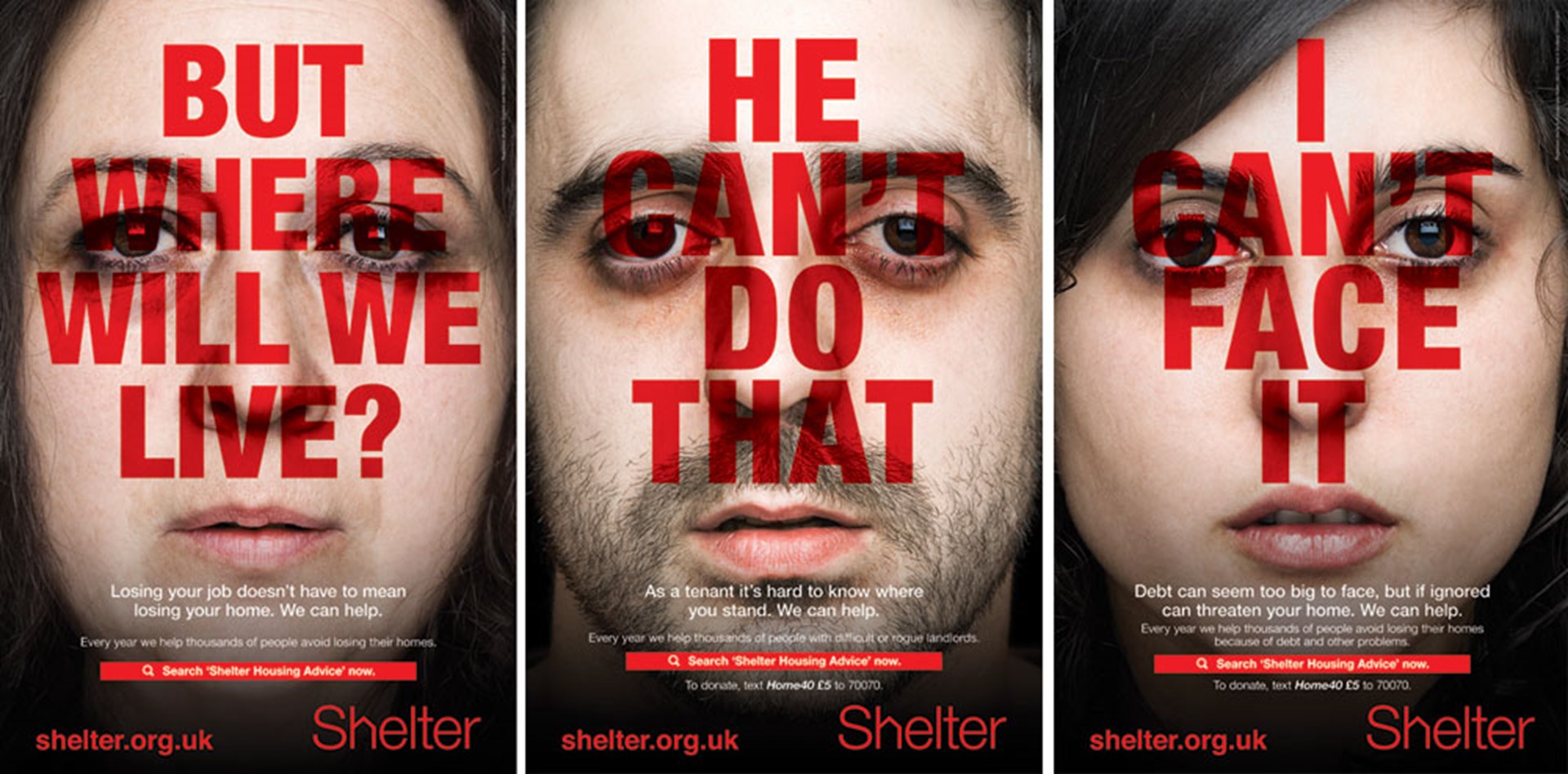 Shelter helps millions of people every year struggling with bad housing or homelessness through our advice, support and legal services. And we campaign to make sure that, one day, no one will have to turn to us for help.
The target audience are adults who can donate to the charity. Shelter have tried to appeal to this audience by using worried faces of people of a similar age to show that someone just like them could need your donation to get their life back on track.
They have used a lot of copy compared to other advertisements, the main part being the red, bold statements on top of the faces. This part will also appeal to the target audience as it makes them question themselves if they can help.
The advertisement as a whole is quite simple but works really well, especially with the pale, worried faces with the bright and bold lettering. So overall, the advert is successful as it attracts the attention of the target audience and makes them think more about how they could possibly help others in need.
In the advertisement they said it is 'scientifically proven' to try give the young audience an impression that the drink will improve their ability. They have used a tagline 'in a different league', to represent how good Gareth Bale is as a football player but to also give off the impression that the drink will make you a better player. They also follow the colour scheme of the drink with the rest of the advert. As an advert as a whole, the advert is successful as it will get people to buy the drink and it also promotes Gareth Bale too.
Shelter
Shelter helps millions of people every year struggling with bad housing or homelessness through our advice, support and legal services. And we campaign to make sure that, one day, no one will have to turn to us for help. The target audience are adults who can donate to the charity. Shelter have tried to appeal to this audience by using worried faces of people of a similar age to show that someone just like them could need your donation to get their life back on track.
They have used a lot of copy compared to other advertisements, the main part being the red, bold statements on top of the faces. This part will also appeal to the target audience as it makes them question themselves if they can help.
The advertisement as a whole is quite simple but works really well, especially with the pale, worried faces with the bright and bold lettering. So overall, the advert is successful as it attracts the attention of the target audience and makes them think more about how they could possibly help others in need.
Old Spice
 Old Spice is a classic men's toiletries brand, that sell aftershave, deodorant and even body wash. Originally, Old Spice advertised their aftershave by using really masculine models and women in swimsuits. But, when their brand was dying out, they decided to go with a more comedic approach to advertisement which suits their now affordable aftershave.
The target audience for Old Spice has changed over time. When their products first came out, they targeted towards more upper class men who wanted to have a manly scent. Now, it is aimed towards older men (30<), usually of lower class.
Their new advertisements have become quite iconic due to their comedic elements and the big name stars featured in them, such as Terry Crews.
This printed advertisement is simple yet it works really well because it shows off the product as well as keeping their comedic element they are famous for. Overall, the advert is successful because it won a handful of awards and has kept the brand relevant to this day.
Comments
Post a Comment