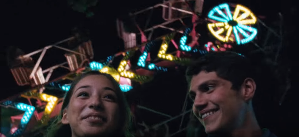
Conventions of Dance Music Videos

Example - 'Changed The Way You Kiss Me'
This music video has the stereo typical 'live for the moment' story, with the character starting the day doing an everyday routine and ending with a party scene. The character shows his increasing emotion during the video. 
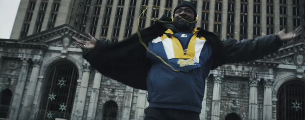
The whole video is in black and white and so gives a more vintage atmosphere to the video and perhaps shows more emotion. This is not seen all that often in modern 'dance' music videos. 

Jack U (Skrillex & Diplo) - To U ft AlunaGeorge

The music video for To U is quite random and disjointed, however has this reoccuring theme of couples and getting back together. The video features different ethnicities and scenery to perhaps suggest that this topic can be applied to everyone.
The video in general is bright and some of it is filmed in the summer time with summer clothes, however this is not always the case.


Disclosure - White Noise ft AlunaGeorge

This music video has much more of a story compared to the previous two. It depicts this character, a security guard, living in a place of poverty, but he sees the best in life, seen through his dancing during the video. There is also a love connection in the video as he tries to impress a women at the end of the video, this could be showing that love can be found anywhere.
The video itself is very dark, emphasising the poverty and devastation of the setting. However, his clothes are the brightest things in the video which could represent him as a person and how he sees the world.

Comparison

All videos have some what of a narrative story to it, however that is not the sole focus of the video. It seems that interesting shots and creative visuals come first before any deep narrative story, which you could say is like dance music itself. There is not much story to it, it just sounds fun etc.

Comments

Popular posts from this blog

Comparison of Two National Newspapers (The Guardian and Daily Mail)

The Berliner or Compact Format (The Guardian) The Guardian was once a broadsheet newspaper, also known as 'the quality press ', due to the more serious approach that it took compared to other popular tabloids . But due to printing costs, The Guardian has now took on the berliner format. Because of these changes, people have said that the ' quality press ' has turned into more like the popular press .  In the cover of The Guardian you can expect to see much more text (' copy ') than in a tabloid paper. This shows that they put a lot more detail into their splash , probably to try and keep the ' quality press ' reputation that they have. The Guardian is a left wing paper. This means that they usually represent the socialist ideology , which is supporting the distribution of wealth and resources in society. The agenda for their stories focus on economics, politics and 'hard news'. The Tabloid (Daily Mail) The Daily Mail takes...

American Beauty - Scene Analysis

Representation  Lester is represented as a submissive and pathetic person, this is shown through his hunched over posture and the way he always obeys to whatever his wife tells him to do. This is the complete opposite to his wife who is a very loud and tumultuous person. She is seen as the master at the table whereas it would usually be the father of the family. However, she has to be quite caring as she took a lot of time preparing a big meal for her family. Then there is Jane, who seems to be the most collected out of all the family, even though she is stereotypical confused and delusional teenager. Mise En Scene The mise en scene in this scene from American Beauty is used to express the personalities of the family. For instance, Lester is wearing very bland clothes, much like the interior of the house, which shows that his life is boring and repetitive. It could also show that he blends in with the house as if he is not there, which would make sense as he stated at th...

The Big Issue - Front Cover Analysis

This cover of The Big Issue has an orange theme to promote the new film T2 Trainspotting, even the logo has changed which they usually keep black and white. Also, their masthead is very different to other magazines as it does not spread across the whole cover and so they have the option to move it around. In this case, they placed the masthead in the top left corner so that it does not affect the image. For this cover they also used a pull quote as the main cover line with a bright orange background which will attracts the audience's eyes to it first. The next thing that pops out to the audience is the black and white picture of the four main characters of the film. They have used this effect to represent them as being old-school, as the first Trainspotting released in 1996. The magazine features the usual release date, price and magazine sell line. These appear on every Big Issue magazine, however it does not need a bar-code as it not sold in shops where it need to be sc...